Current mission → Fonds Prévention Argile
 FREN
FREN
Parents' association: logo design
A sun, a smile and the blue of the ocean: the logo for a parents' association in the Basque Country.
Current mission → Fonds Prévention Argile
FREN
A sun, a smile and the blue of the ocean: the logo for a parents' association in the Basque Country.
At a glance
A parents' association needed a logo: simple, cheerful and easy to print.
A logo and its badge variations, including a black and white version for print.
I know there's plenty of room for improvement: logos aren't the exercise that comes most naturally to me.
Switching up the type of project feels good, and makes me want to do more.
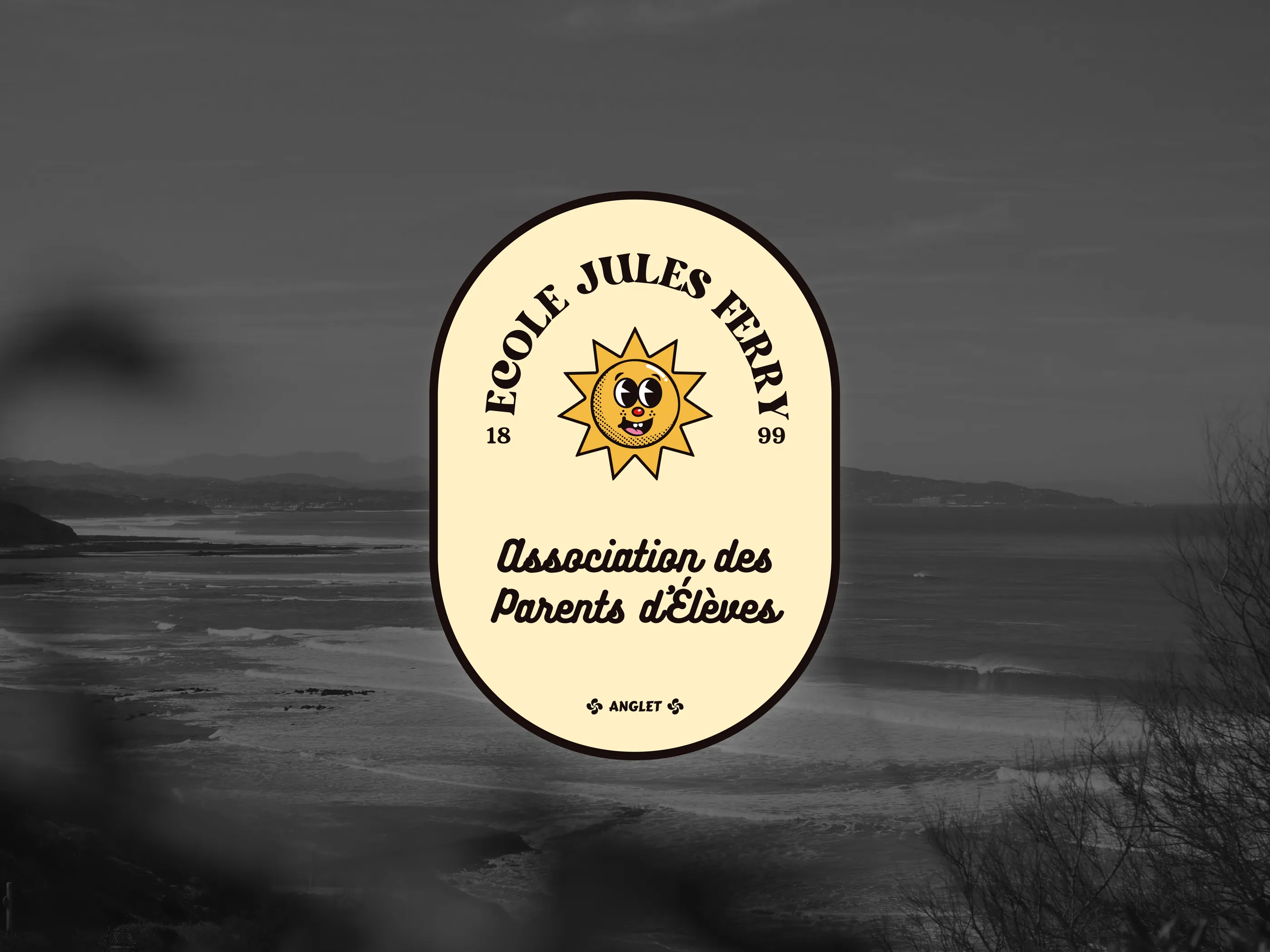
I love logos, but they've always been hard for me. I've always found them much more difficult than designing websites or brand identities.
I hadn't worked on a logo in a long time, so when the chance came up to design one for a parents' association, I jumped at it.
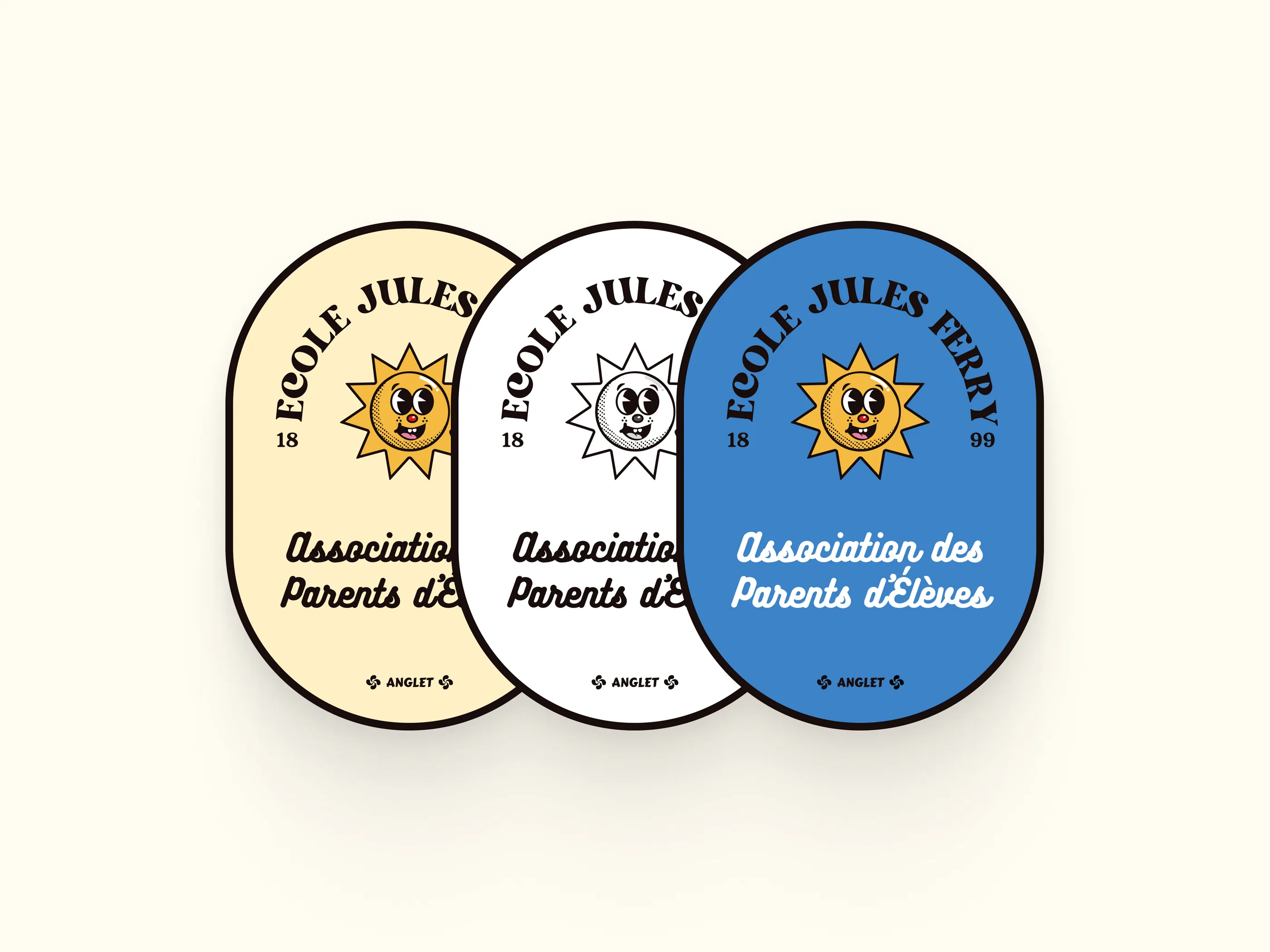
Visually, nothing too sophisticated: a sun with a smile and a childlike look for the school, but also for the often sunny local surroundings (the Basque Country). The blue refers to the ocean and is also one of the town's colors.
For the typeface, I picked a cheerful yet highly legible one, so every element stays easy to read across print media (hence the black and white version).
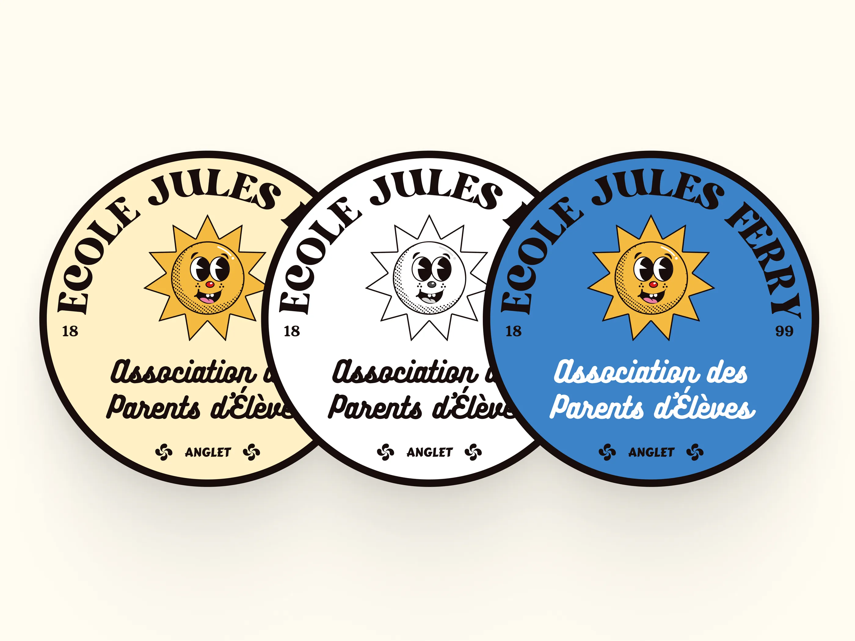
And there you go, nothing groundbreaking, but I enjoyed working on this logo. Even though I know there's plenty of room for improvement, it's always nice to switch up the type of project. It makes me want to do more...